The art of pixel detailing
A look back at maximal UI design
First, it must be noted that this is a reflection of the old “green velvet” approach to UI design. This was a world where over-the-top iOS was all we knew—more of a knee-jerk reaction from designers having to simulate analog controls in their all digital designs. Adding more stuff to a screen seemed to equate quality in particular applications. Thankfully standards in web and mobile UI came in time to help reign in the madness.

This website was designed when I was at Qorvis for a client called National Sporting Library & Museum. There’s a surprising surplus of these organizations in and around Washington DC, which is where this work was based and produced.
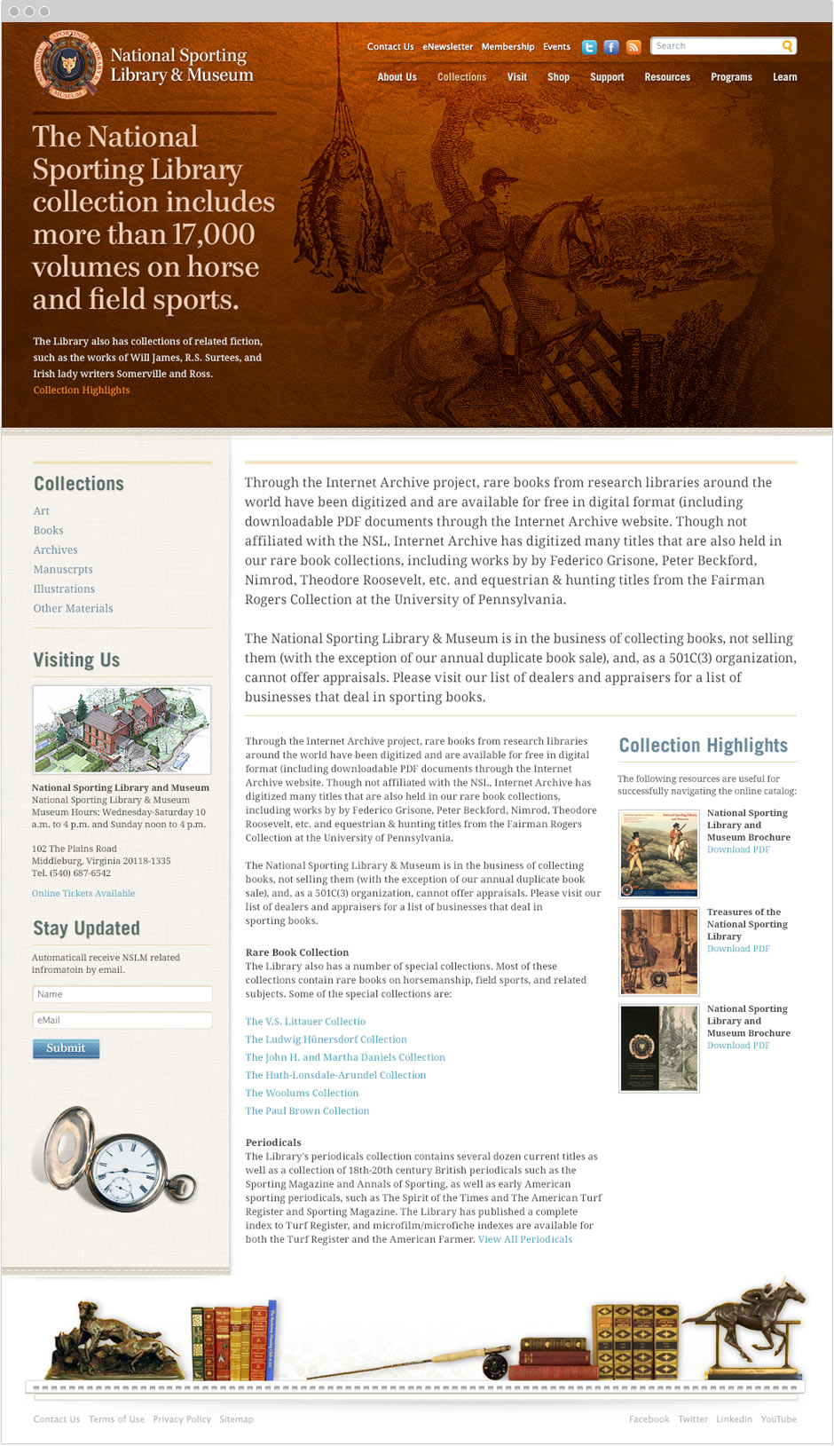
Fun facts, It’s an old club with a museum of esteemed collections of field sporting material—and if you are a fan of such regalia, this is the world for you. Ultimately, this material lent itself to how I would approach the overall UI. Background elements, foreground elements, functional components, and text would all reflect collection materials and objects from the museum archives
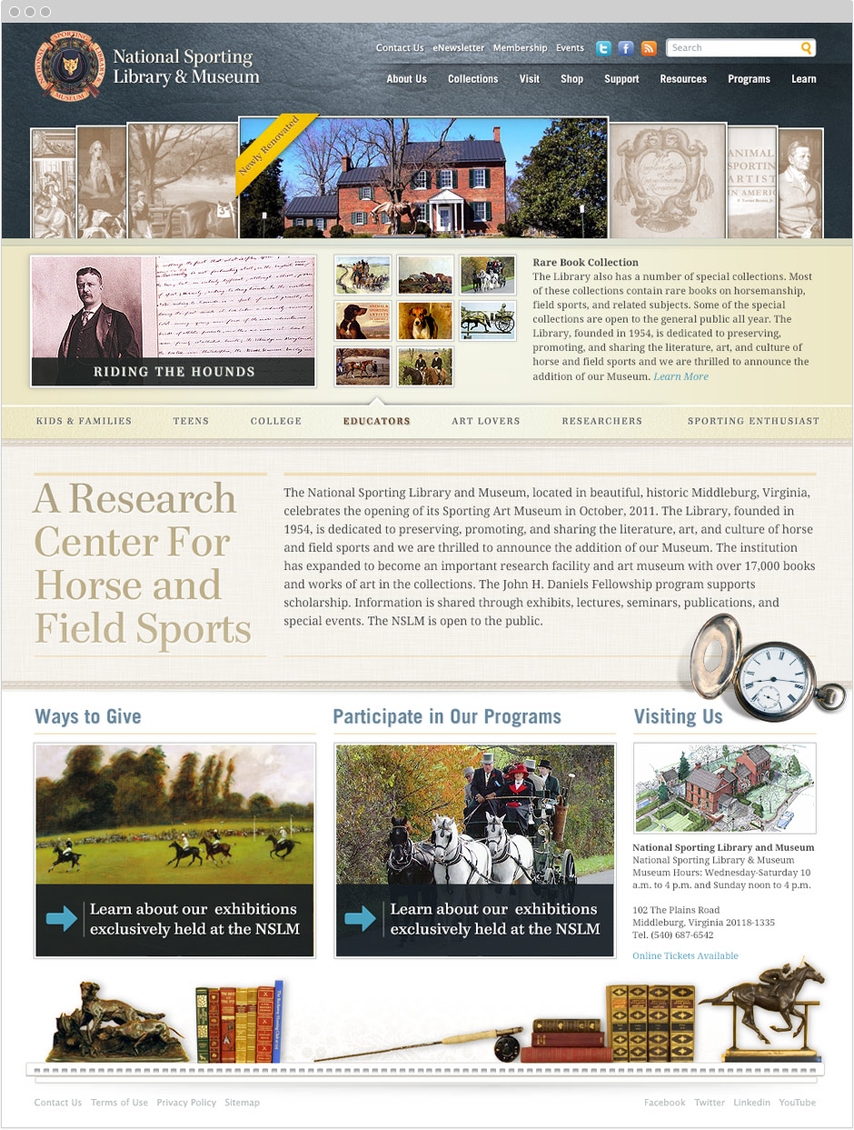
The collection of photos alone provided much in the way of exuding that feeling of historied traditions. Particular details in the photos stood out to me, like the leather horse tackle, or the film grain from old prints. I also looked at other architectural elements associated with the physical building itself which housed the museum collections. Details like the colonial-styled crown molding in the interiors lent form to a functional need such as a footer nav.
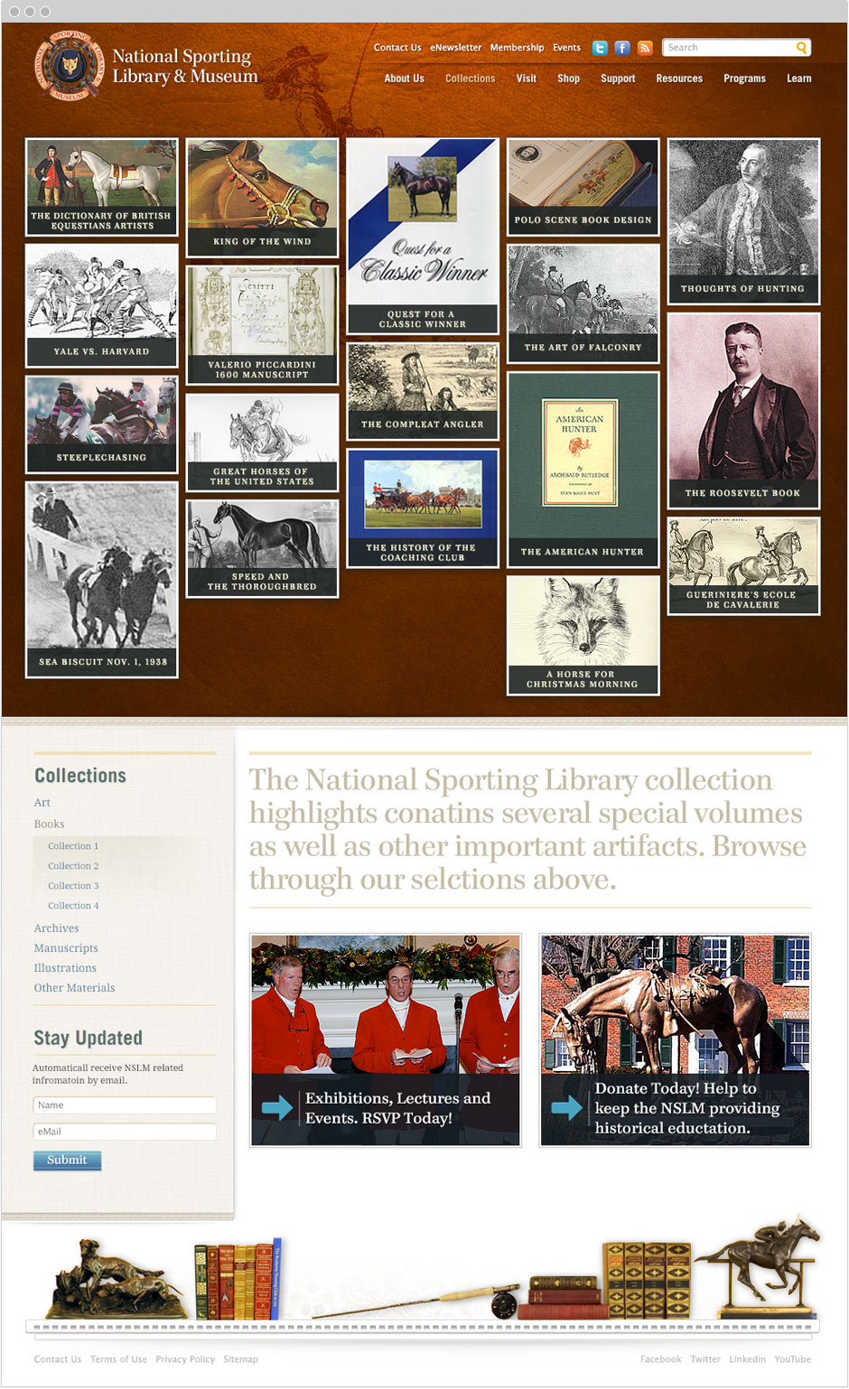
Other aesthetic styles were also included such as large lead-in photos as backgrounds with receded color and opacity—pushing further that classical, tradition-bound feel. Matching a handful of typefaces that would’ve been employed in lithography during that founding period further added to the historic feeling, which was utilized globally across the site.
My favorite aspect of this old project of mine is that despite its dated look, its glaring no-nos that contemporary designers would never replicate is how much detailing and Photoshop magic went into the UI and image renderings. Detail pixel pushing that was all about making it look artistically perfect and reflecting the client’s culture was all that mattered as a young burgeoning designer. I wanted it to look like this old historic website for an old historic museum, and it worked.
The site ran for the client, and the build was a slog leading up to the QA. Lots of testing and reworking of design details to smooth out the overall experience; ultimately though it was a successful launch. Contemporary interactive experiences like a website, and interactive landing pages, or most mobile apps incorporate established design patterns from community-adopted design systems like Google’s Material Design, Apple’s iOS, or IBM’s Carbon. Helping to cut through visual clutter that distracts users while helping to remove friction from users having to learn a new UI pattern that’s unnecessary.
As it stands today, this method of web design and style is no longer feasible for many reasons. I don’t miss this approach to web design either, I haven’t touched Photoshop for years when it comes to creating anything needed for interactive experiences. It was a Wild West state of web design which part of me honestly loved and enjoyed it. Creative autonomy abounded—and they just don’t make ‘em like this anymore. This project provided me with a bridge between my artistic instincts and approach to early digital design, and to my analytical and user-centric approach to designing new solutions based on fundamentals of best UX practices.
Ultimately this work led to another large interactive undertaking for another national and historic landmark with a more “founding fathers” vibe. The greenlight for the discovery, drafting, designing, and launching of a new interactive museum and website for George Washington’s Mount Vernon.