Infographic design + process
Starting from scratch
Infographics are a great way to illustrate data and content in a quickly consumable fashion. In an effort to further distinguish the Atomic Robot brand through its omnichannel marketing, I began creating a new visual direction that could be scaled across multiple subjects. In an effort to give some levity to the material, I decided to focus on a thematic approach. This would allow the team to visually explore and push the concepts further while not being too limited by branding guidelines. Certain elements would remain consistent with the parent brand, particularly with illustration, color, and the footer content.

Inspiration
I began my initial discovery work by pulling some inspirational examples to kick things off. I wanted to focus on the titling in a way that provided a visual anchor. Something that was appealing enough to draw the viewer to the detailed content below. With this in mind, I looked at a series of illustrations and typography examples that mimicked my desired style.

Early concepts
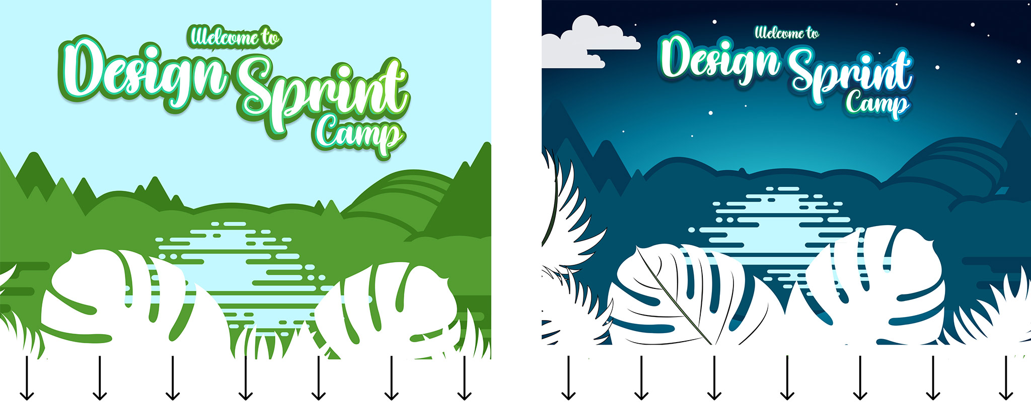
There were a few details that were locked down beforehand. Subject matter and content were framed out; the title was not. Parent branding was to be incorporated in some manner—in this iteration, I focused on the footer as a credit section. This allowed me to include our logo, typography, and some of the primary color palettes. The initial type compositions were kept loose to explore the typefaces I had chosen in more detail. I wanted to highlight the individual characters and figures unique to the typefaces I was studying. In turn, this would provide even more unique arrangements.
The result of this type-driven study provided two distinct visual concepts to pursue. The first was designated “The Design Sprint Frameworks,” and the second, “Design Sprint Camp.”
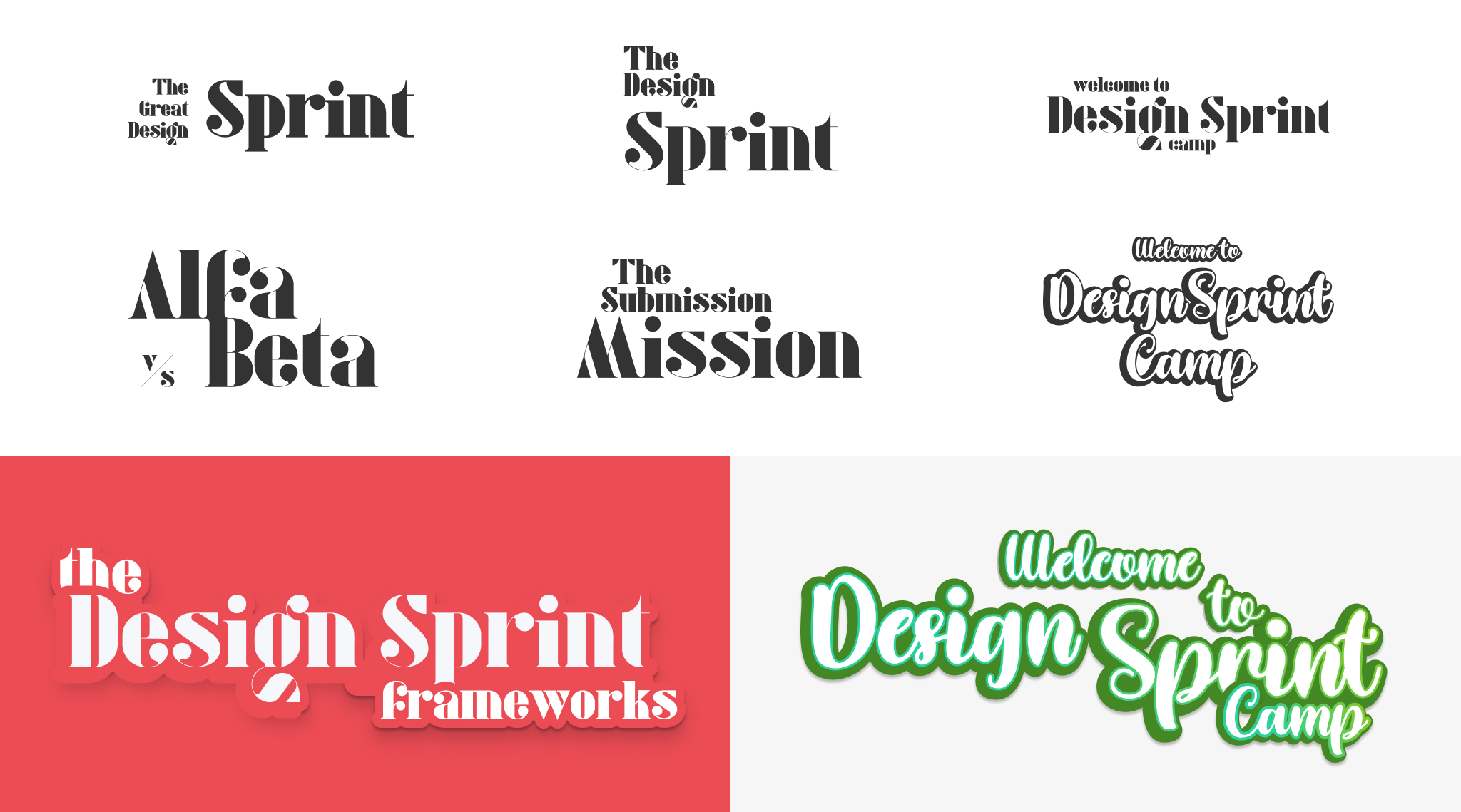
I liked both versions initially—the first gave off a feeling of mystery, while the second was much more organic and youthful. With these concepts in place, I continued with the remaining components and layout.
Working backward
I almost always begin visual exploration through thumbnail sketches. This is still the quickest way to visualize a composition and draw out quick and dirty ideas. In this instance, I already had a few concrete ideas that I would already commit to. It’s slightly a cart before the horse approach, but to be honest—after creating so many of these over the years, I know where to shave time and when to double down. Still, from a content perspective, I needed to lay it out.
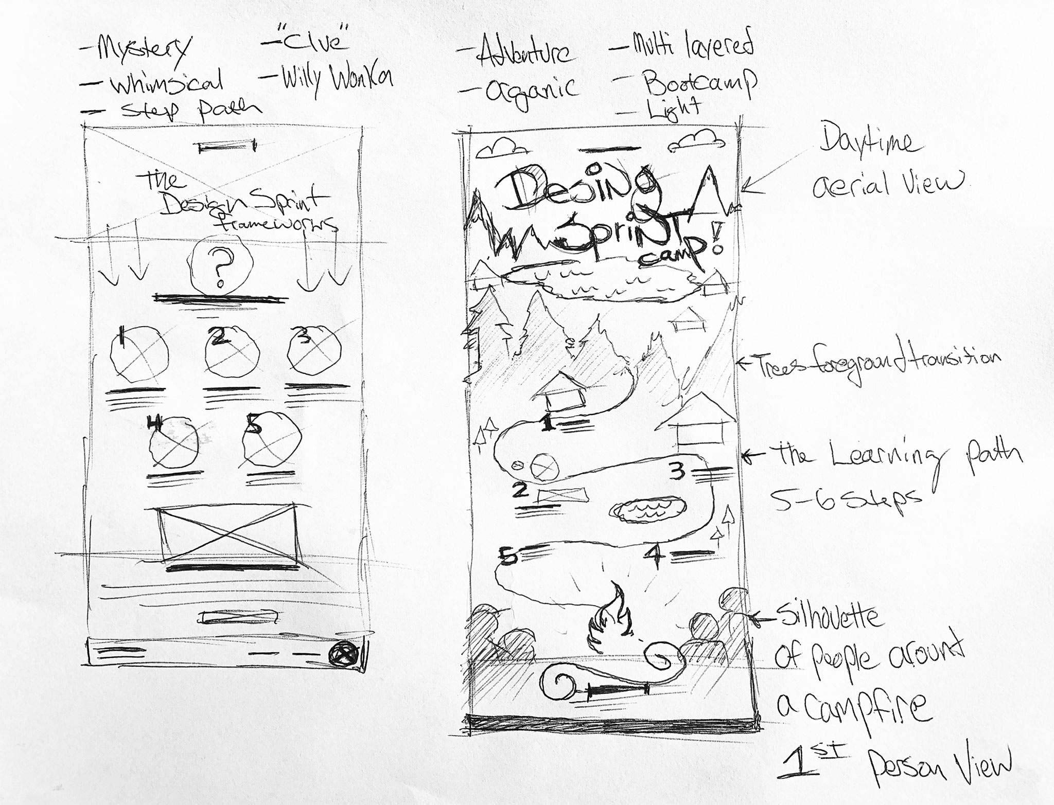
Decision time
There would be time to finalize a few directions in a perfect world. I had to make a call to move forward with one concept. To complete both, I would have spent less time providing all custom illustrations by our deadline. As a result, we agreed as a team to run with the “frameworks” idea so we could make our launch schedule.
The result was a fun and engaging experience that would act as a standalone graphic and a landing page template. The other concept will resurface in some iteration as a back pocket solution for another need.