Crafting a GitHub App + Mascot
Initial concept
When I first joined the Atomic Robot team, I sat down with Alex, our CEO, and discussed some initial ideas he had for an integrated app that would allow users to interact with their Git repositories. We decided to spin up the visuals for this project and look at some fun directions for a brand mascot. This first collaboration would become Project Octoscope.

Octo mascot
I had been sitting on a few ideas for a while. My first day on the project was more visual regurgitation than anything. I stuck to designing in Figma for the most part, which is a godsend for working as a team. The first move was sketching out everything in my head.
The overall feel for this was to be fun and approachable. In particular, we wanted to make this for the development community. We decided to expand on the mascot idea to attain the feel we wanted the brand to exude. No marketing jargon, odd stock photos, etc. Mr./Mrs. Octo started somewhere between a ghost and a jelly mold. Almost immediately, I saw similarities to another more famous social ghost character. I intentionally pronounced some features that would give it a unique look—the head became more prominent, and the eye became more pronounced. Eight arms proved too busy in small reproductions, so I went with six—similar thinking to Mickey Mouse’s three fingers and one thumb.

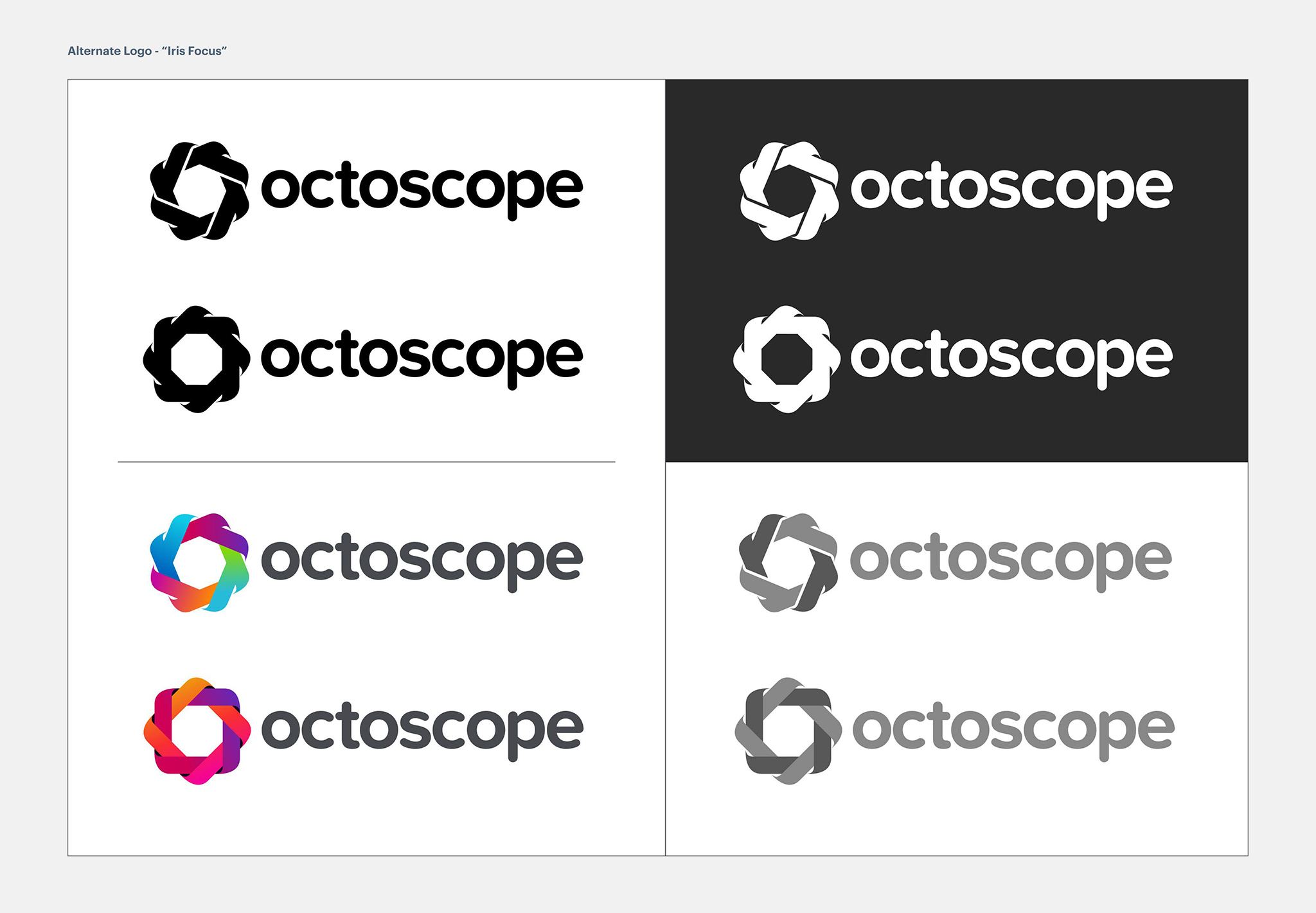
The mark
After completing a few thumbnail sessions, I focused on two outstanding ideas. The first was the mascot-driven idea, while the second was the “iris” concept. The concept is based on the metaphor of a user observing and focusing on data. I wanted to draw a parallel to this action through symbolism. This thinking bore out the final design for the second idea.
Information architecture and wires
While working on the logo and branding ideas, I had to get the effort underway for the IA and wireframes. We kept it simple to allow our team to launch an MVP and reduce upfront development time. The core nav consists of a user-selected watch list, a repository search, and the dashboard/profile.

UI design + the component library
The initial approach to designing the user interface was to throw multiple ideas at the wall. Depending on the type of project and the level of effort involved, I will limit myself to a few design options. It keeps the work on-brand and is the most efficient way to iterate. With this project, I wanted to take more risks upfront to see what worked, what didn’t, and what happy accidents I’d stumble on.
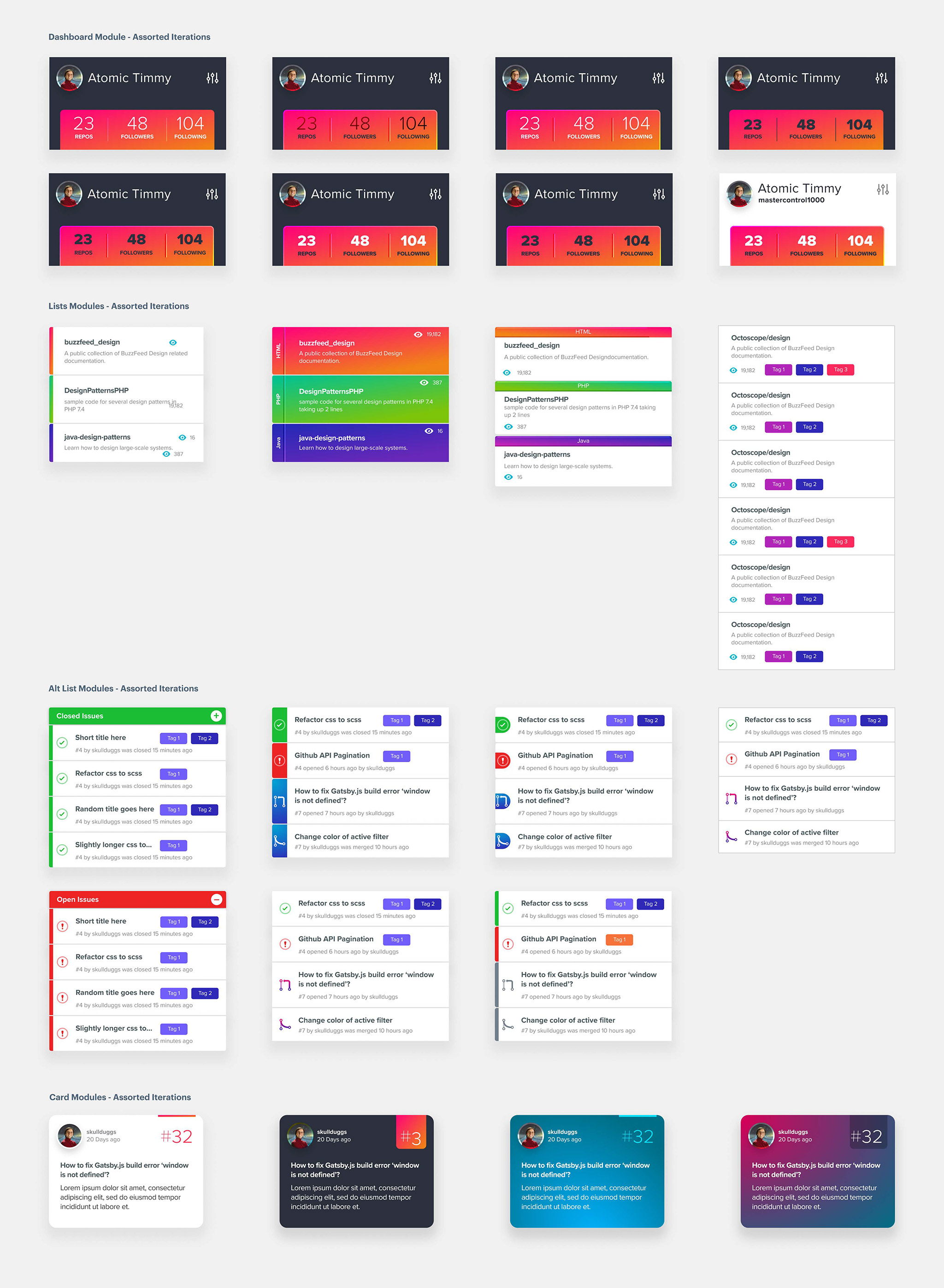
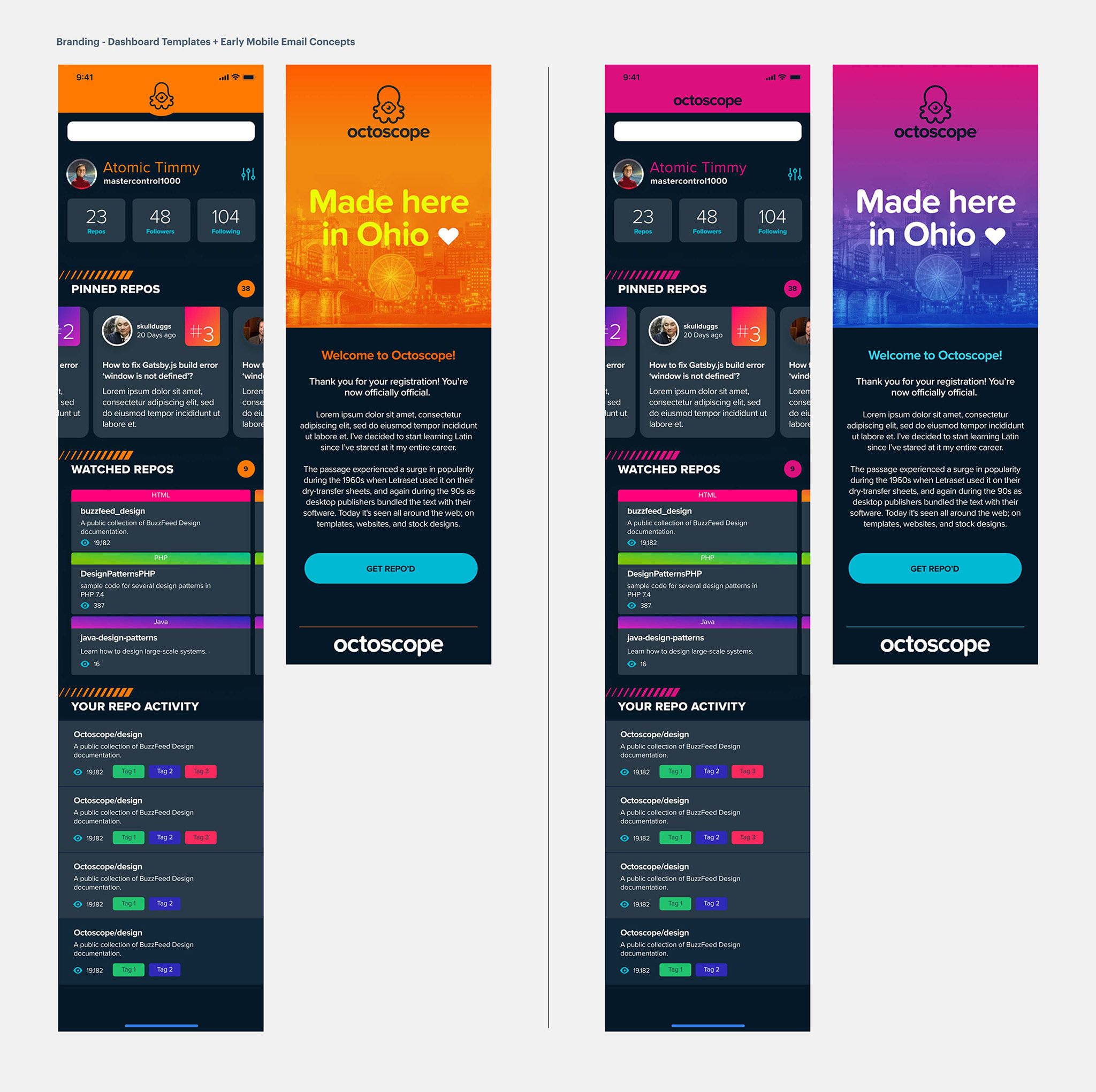
The dashboard and profile views presented the most significant opportunity to push the more progressive details. Components and modules were dialed back visually. A color system was also introduced to help tag particular variables that the user wished to monitor.

High fidelity designs
The final work was compiling a set of components in various screen templates and testing. The final evolution of the work is a vibrant and fun experience with a cool mascot guy. The brand’s mark and tonality is my favorite part of this. Current updates to the UI include pulling back on the color palette to strengthen the interface and branding further. Accessibility testing and user testing are also driving continued work.